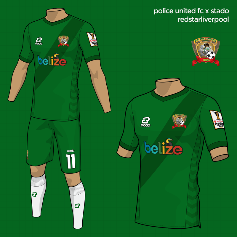
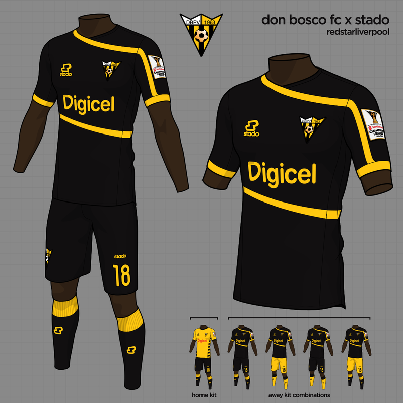
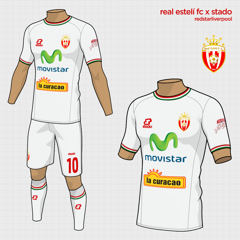
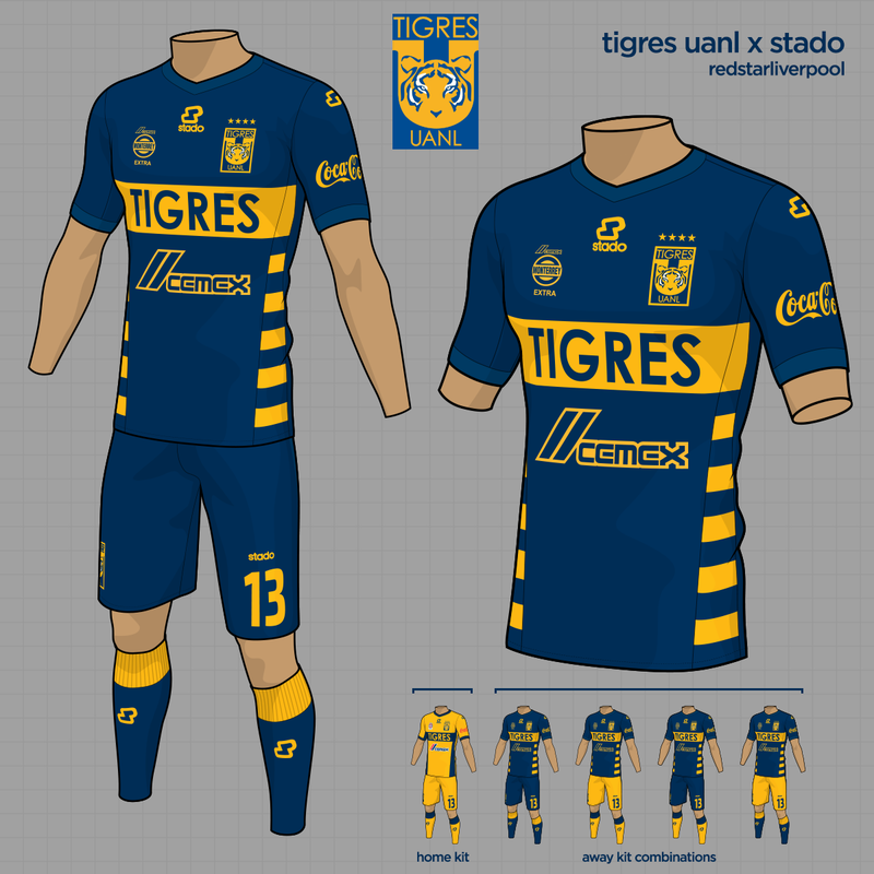
Here are some fresh kits from my participation in the latest tournament over at designfootball, this time involving the teams from this season's CONCACAF Champions League.
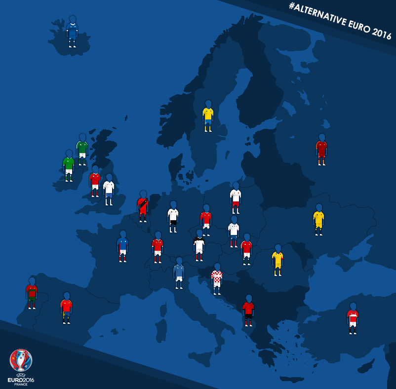 #AlternativeEuro2016With Euro 2016 rapidly approaching, I took the opportunity to design a set of shirts for every competing nation, using their current manufacturer but deviating from some of the design directions these brands have recently embarked upon. For Nike teams, I have used the same basic, invented template, mirroring the brand's real life strategy, while my made up Adidas and Puma templates are also used by several of the countries at a time. 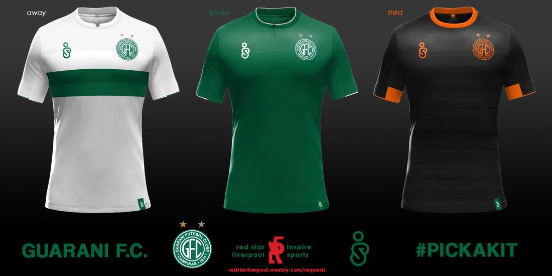 After a bit of a hiatus, here is the third entry in my #PickAKit requests series (add your suggestion to the list here). This time, Guarani FC of the Brazilian third division were the team chosen. Based in the city of Campinas in southern Brazil, the club have a proud history and were once regulars in Série A. For their shirts, I chose to use the a pre-existing template from my fantasy sportswear brand, which I previously used as part of my Bolivian national team project. I felt this would fit well, introducing some uniformity across my South American designs. I've gone for simplicity here; the predominantly green home shirt with some very simple white embellishments, and the white away shirt, with green sash to link back to the home strip. Finally, for the third shirt I decided to try a modern style, bringing out all the details in a vibrant orange. Home Kit: A two tone green shirt, the upper panel being constructed of a slightly thicker mesh material. White flashes on collar and sleeve peaks.
Away Kit: Simple white shirt, a reversal of the home kit, but with two tone sash, designed to link to the colour of the home shirt. Third Kit: Another black third shirt from me, featuring a vibrant orange detailing and a unique 'brushed knit' texture on the main body of the shirt. 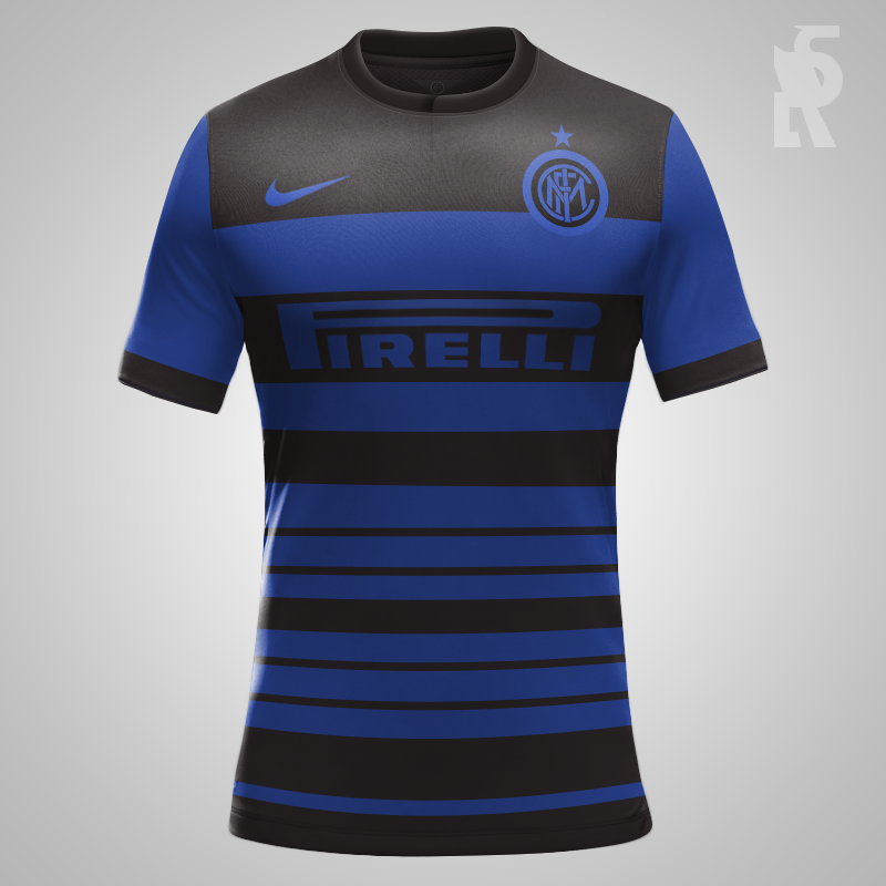
A fun little attempt at creating a football kit inspired by the internet phenomenon that was #TheDress. I chose Inter as the team because of their colour scheme, which historically incorporates blue and black AND white and gold. Which do you see?
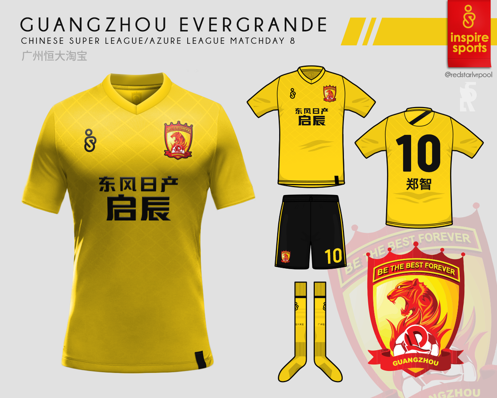 My entry for matchday 8 of Design Football's Azure League - An away kit concept for Guangzhou Evergrande of China.
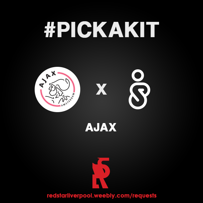
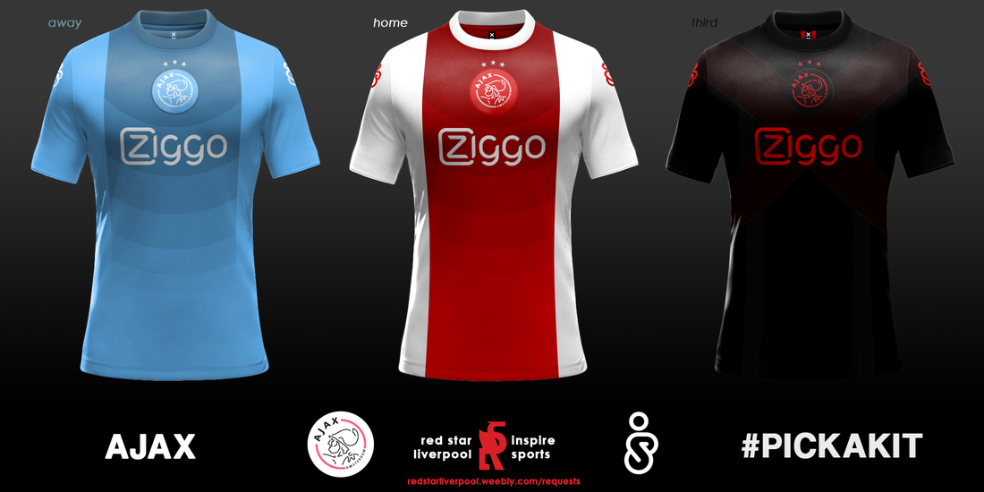 The second team to be randomly picked out from the requests I've received (request a kit here) was Ajax, of Amsterdam. Ajax's reputation as European royalty and past exponents of 'total football' means that they are hugely well regarded across the continent. Designing shirts for a team that used to be led by Johan Cruyff was more of a challenge than I initially expected. There is very little you can alter with the Home shirt, and why would you want to - the red and white strip is instantly recognisable and remains hugely evocative. I returned the crest to the centre, where it was traditionally positioned, and added a subtle gradient just to make it a little more unique. I chose a traditional blue shade for the away shirt, then, as I am wont to do, I made the third shirt black. Home Kit: The classic red and white design, with a modern gradient effect inserted. The logo is brought central, sacrificing the inspire brand logo to either sleeve.
Away Kit: Blue shirt, with a pattern designed to link to the home shirt. Third Kit: A black number, featuring a dark red double sash that forms an x, a nod to the City of Amsterdam's flag. All kits feature a design inside the collar that is based on Amsterdam's xxx emblem. 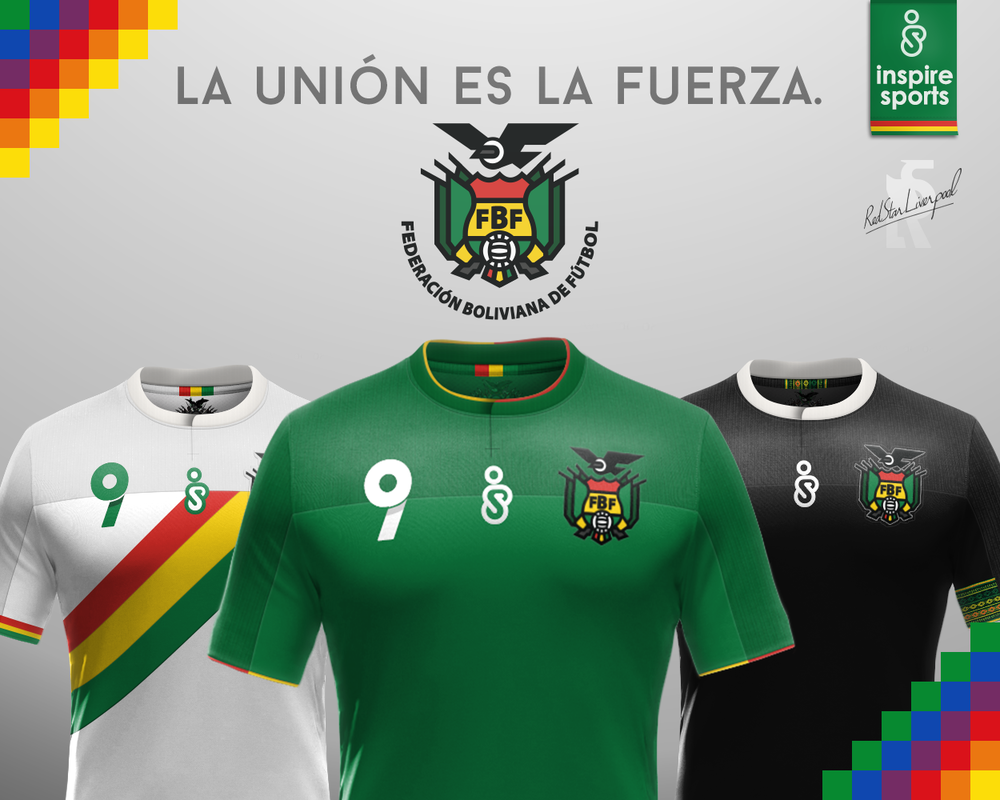 Introducing my Bolivian National Team project, as part of a competition entry on designfootball.com. This project involved redesigning the clearly outdated logo of the FBF (Bolivian Football Federation), and designing a set of home and away kits for the team. 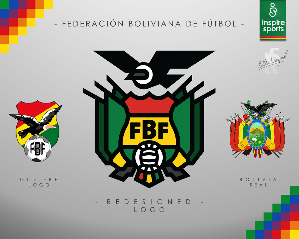 My redesign of the logo takes the essential elements from both the previous FBF logo and the Bolivian national seal, to create a minimalist and unique crest that stands out on the team uniform Home Kit: The classic Green shirt of Bolivia, with Red and Yellow trim and White numbering. Alternate 1: A simple white away kit, featuring a sash and cuffs which use the national flag's colours. Alternate 2: A more unconventional kit inspired by the Andean Condor, which appears on the Seal of Bolivia. Alternate 3: Finally, this shirt incorporates traditional Bolivian textile patterns into the shoulders, and uses pink as a counterpoint to the usual colour scheme of the national side. Full concepts for each kit are found below: 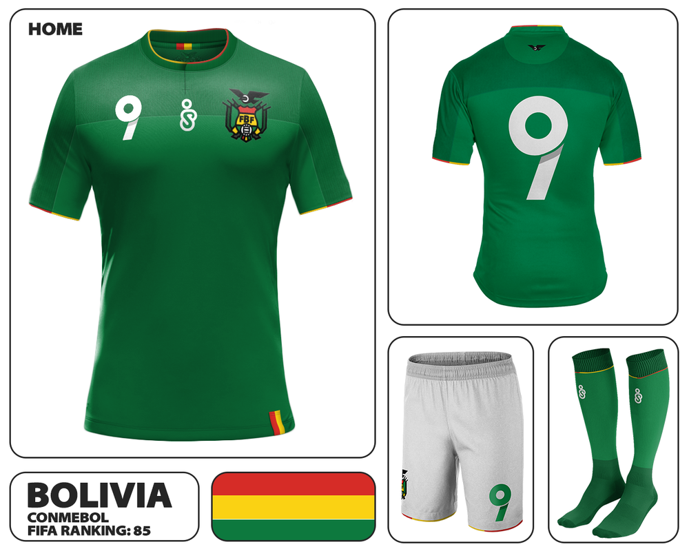 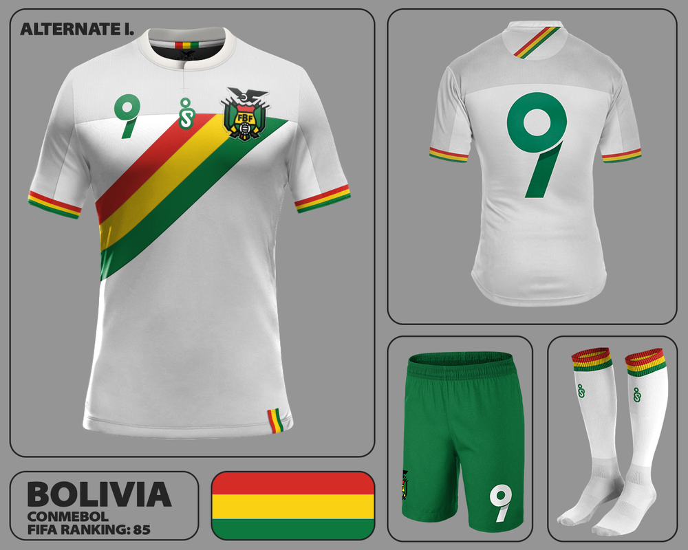 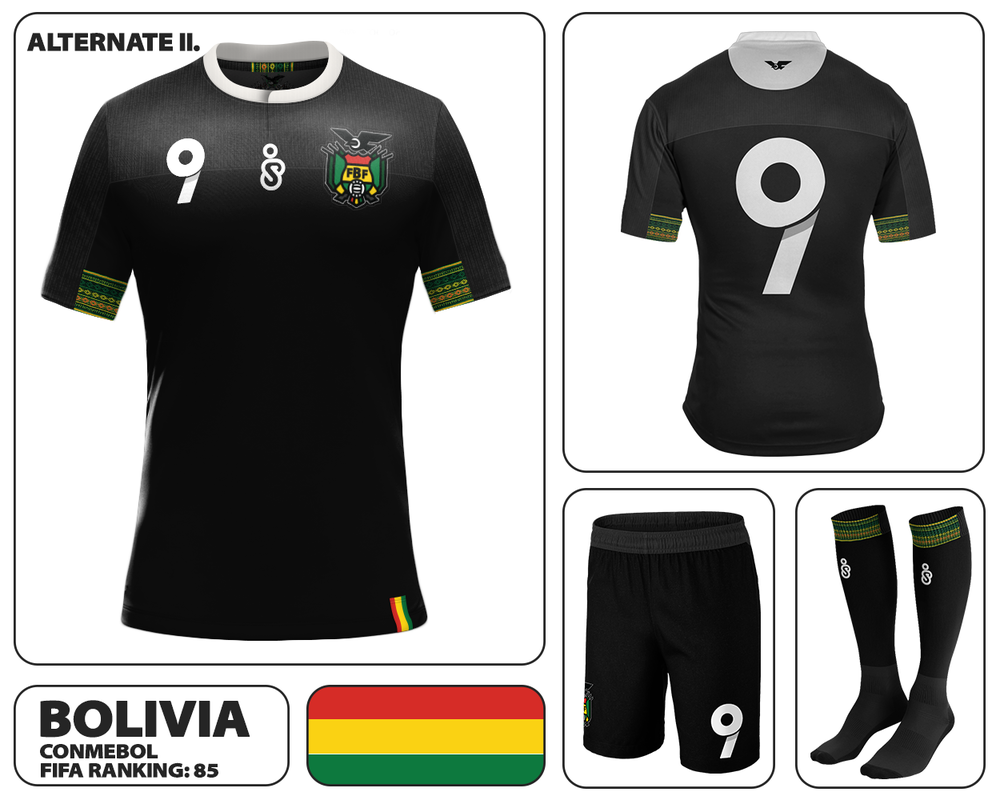 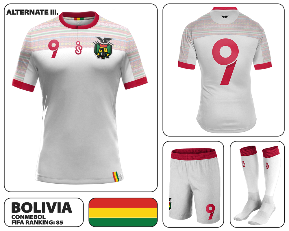 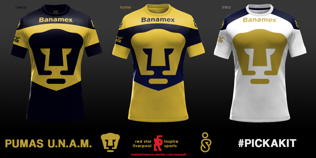
The first team to be randomly picked out from the requests I've received (request a kit here) was Club de Fútbol Universidad Nacional A. C., or 'Pumas de la UNAM', of Mexico City. One of the most popular and successful teams in Mexico, their kits are very recognisable, traditionally featuring their striking puma logo across the body of the shirt. Designing kits for Pumas was a difficult task: the logo's prominence was non-negotiable, so any other details to the shirt, including sponsors, had to be fitted in around this focal point. I chose to frame the logo with a graphical element on both the home and away jersey, allowing me to include subtle patterns and touches that would not detract from the logo itself. U.N.A.M.'s kits have swapped colours over the years, but I chose to follow the latest trend of having a predominantly gold home strip. The white kit was based on various classic Pumas kits which carried the same shade. Home Kit: Yellow shirt, featuring a subtle 'night sky' gradient on the blue portion of the jersey, with stars in the upper part.
Away Kit: Blue shirt, with satin Aztec calendar design featured in the yellow area. Third Kit: Simple white kit with blue shoulder sections. All kits feature the emblem of the Universidad Nacional Autónoma de México inside the back of the collar, the institution where the club was founded and is still based. 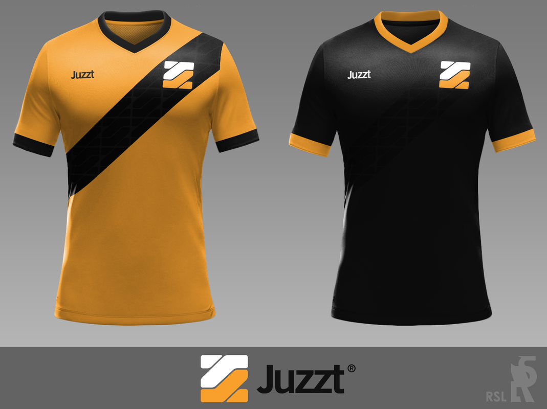
I entered a competition to design a shirt for the Dutch football agency, Juzzt Football. The competition homepage can be found here. Above are my two entries, where I've tried to fuse simplicity and the colours of the agency, with a subtle sash pattern to bring the shirt bang up to date. I chose orange as the primary colour for very obvious reasons, of course.
|